Creating a Bear-y Wintery Scene
Environment, light, and playing with snow.
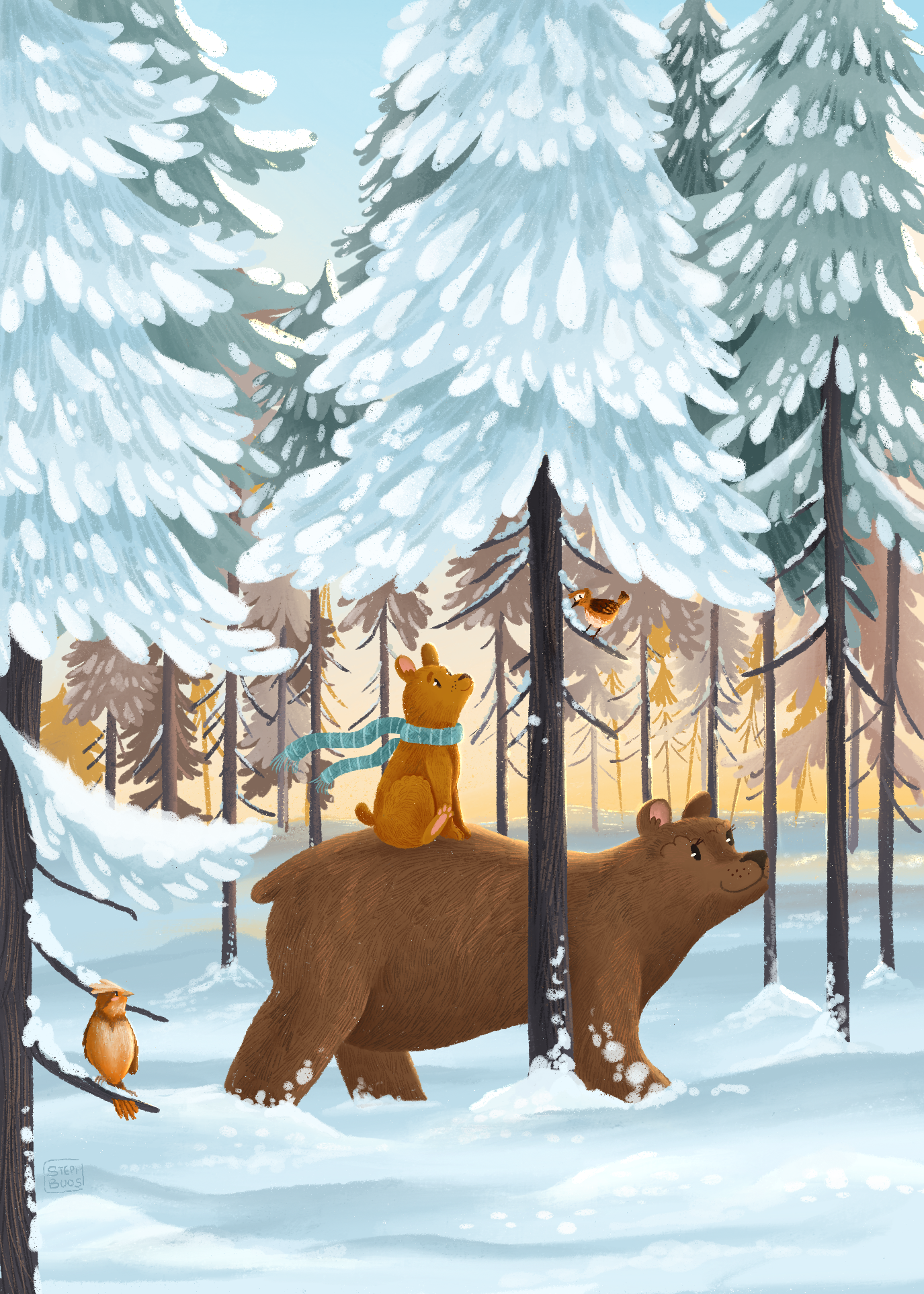
Those were the thoughts that sparked the beginnings of this illustration. In Canada, our winters can be long, cold, and dreary. However there’s this special stillness that happens in the forests that is unique to the cold snowy months. When the air is brisk and fresh from the chill, and the pines are powered with snow, the sunlight sparkles all around you and the world is quiet. You can easily imagine the forest is asleep, with only a few visitors making tracks through the trees.
I wanted to try and capture that feeling, and see if I could replicate that natural complimentary colour palette that occurs when the sun is breaking through an evergreen forest.
First things first, I needed references. I usually collect a few images and collage them together for easy viewing. I take colours from pictures I find most striking and work up a colour palette that makes sense with the landscape. Picking colours is hard! I’ve taken multiple courses on colour theory now and my pro tip is to pull from photography—hasn’t steered me wrong yet!
This is the final palette I ended up with.
As you can see, the colours can be simplified into the two complimentary tones of orange and blue. I created harmony by keeping a similar saturation theme for all the colours.
What scared me…
I’m by all means NOT an expert in winter landscapes. The last true wintery scene I worked on was back in February 2021. So there were a few elements I was a little nervous about—that I knew I would take a while fiddling with:
Creating depth for the forest background without overcrowding or creating competing colour segments.
Colour coordination: finding the balance between the cool and warm colours in the palette
The snowy branches. How to add all the snow detail in my own style, without leaning too much into realism.
Forest background
Layers, my friend. When working digitally, use your layers! From the progression images below, you’ll see how I organizes my trees into various layers, using size and colour to create depth. I knew my light source was behind the forest, so those trees further away would be those rice, gold colours. As we move forward, the trees progress to the cool tones of the piece.
Once I decided to stick with the complimentary colour theme for this piece, it made the process much simpler. Adding details only where I deemed necessary also helped. I could have done wild with branches, trees, underbrush, etc, but I didn’t want to overwhelm the composition. As I added in my focal characters, I realized I actually needed some white space to bring attention to mother bear and her cub. I ended up deleting quite a few trees to achieve that!
Adding light
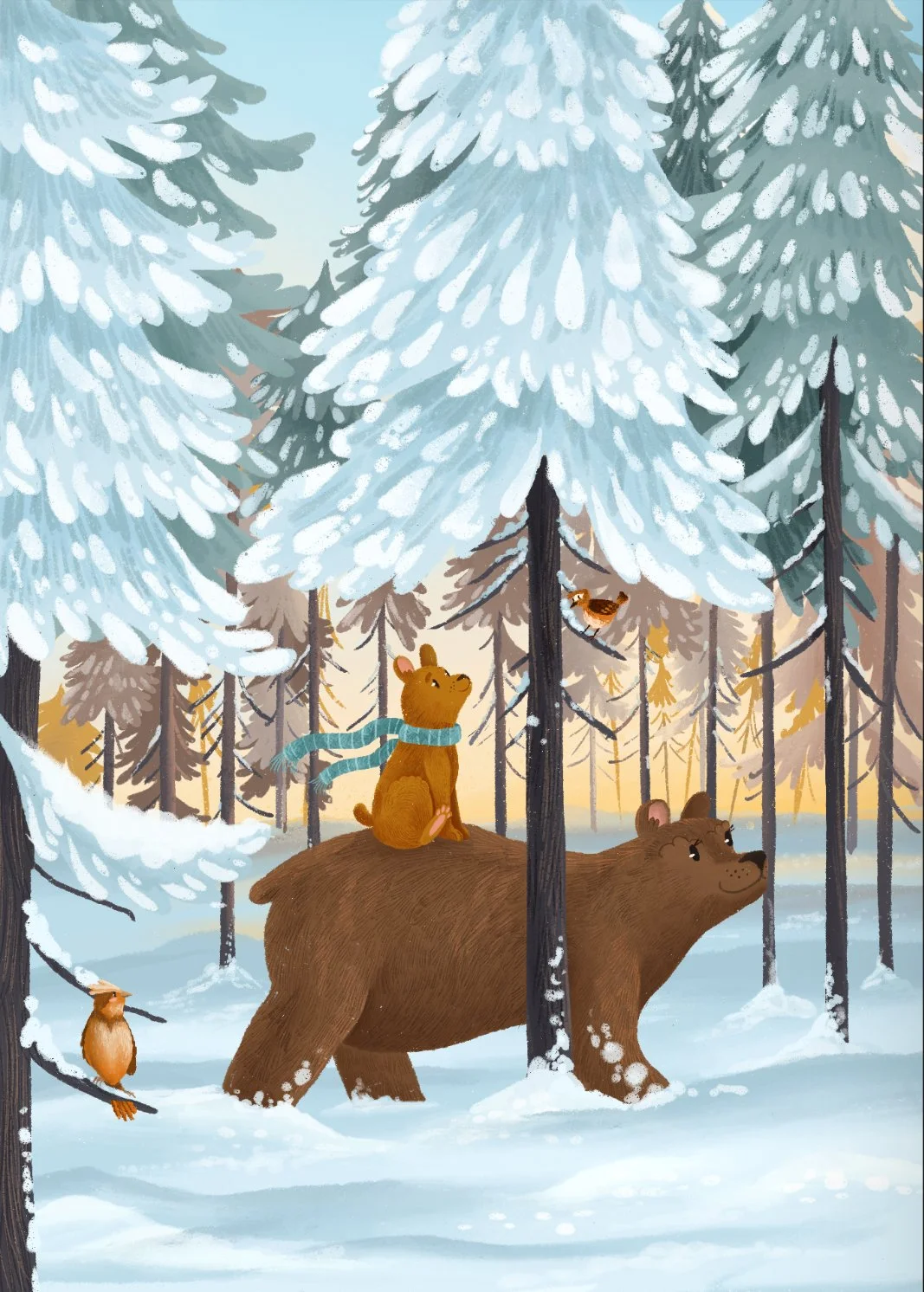
My favourite part. Adding the light overlay to the trees and the bears really made this piece come together. It brought that softness needed to really sell this quiet winter walk. It’s subtle, but see if you can notice the different (focus on the bears).
It’s such a small thing, but this is where the details count! It’s those little touches that add a bit of story and personality to your illustration.


